Byjus. Branding & Conversion Design
As the Creative Lead for Byju's Future School, an international ed-tech company, I had a key role in the brand's adaptation for the UK market. Working closely with two designers, the Brand Director, and the Performance Marketing Team, we aimed to increase brand awareness of Byju's online courses for children of all ages.
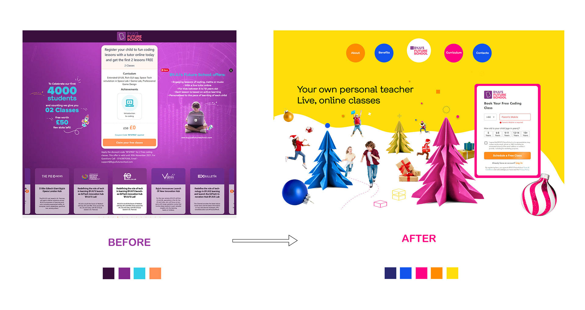
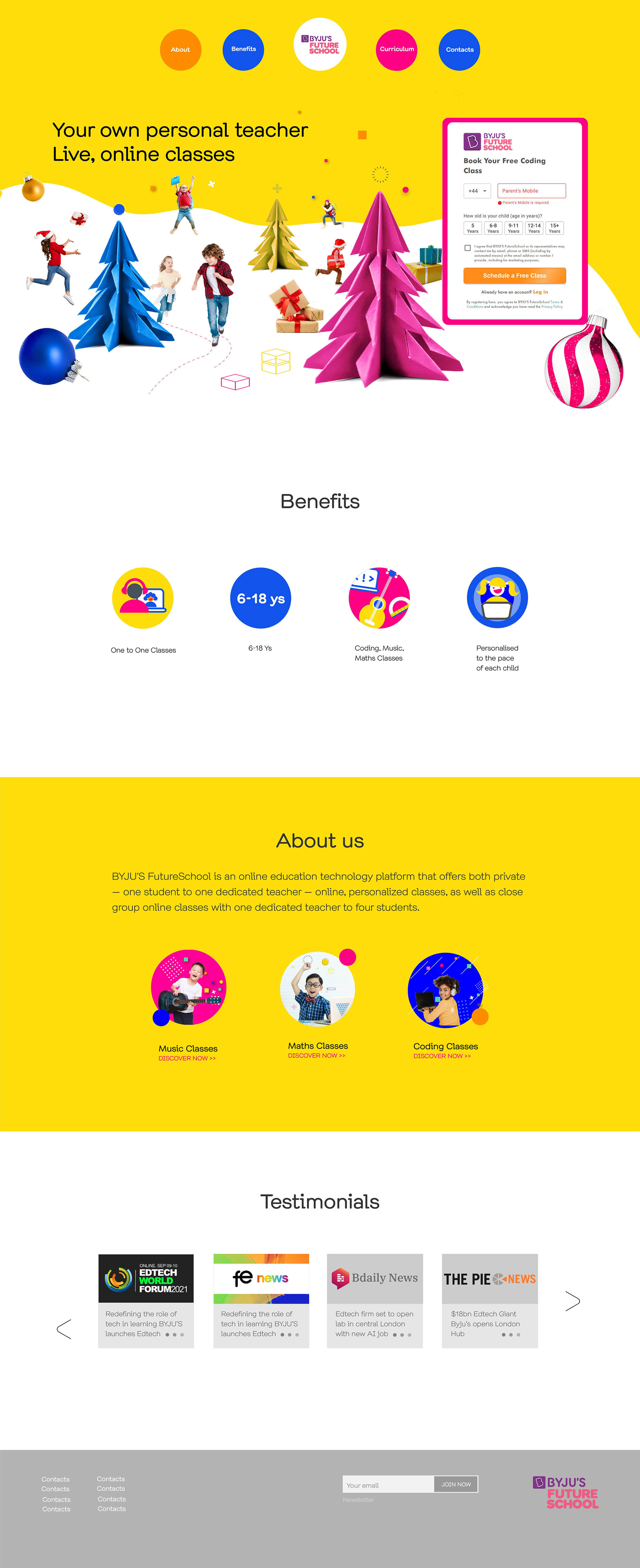
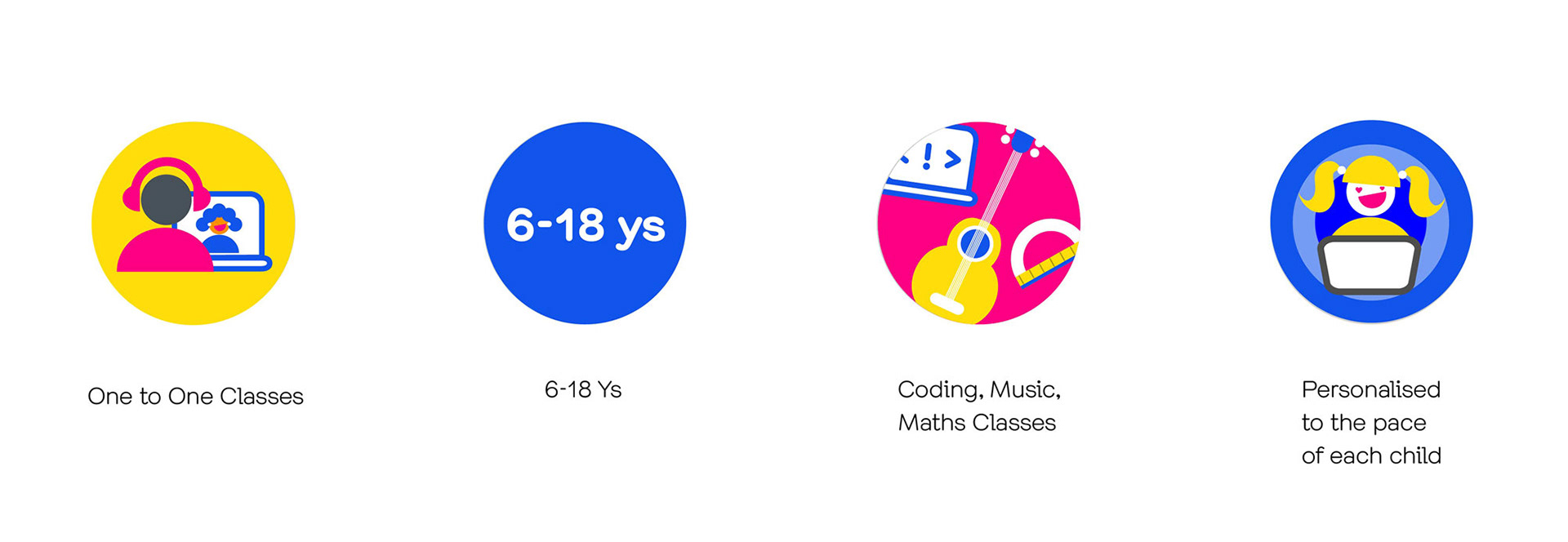
I have proposed a colour scheme of vivid bright shades of magenta, bright blue and yellow, to communicate the curiosity and enthusiasm of children in opposition to the dark purple previously used. The same cheerful and energetic approach is used in the dynamic and energetic design of the icons and choice of imagery. I created compositions where children are engaged in playful activity with other children in opposition to the previously used imagery of a lonely child with big headphones and a laptop. To effectively communicate the main benefits of the courses, I opted for concise, clear copy, rather than abstract data.
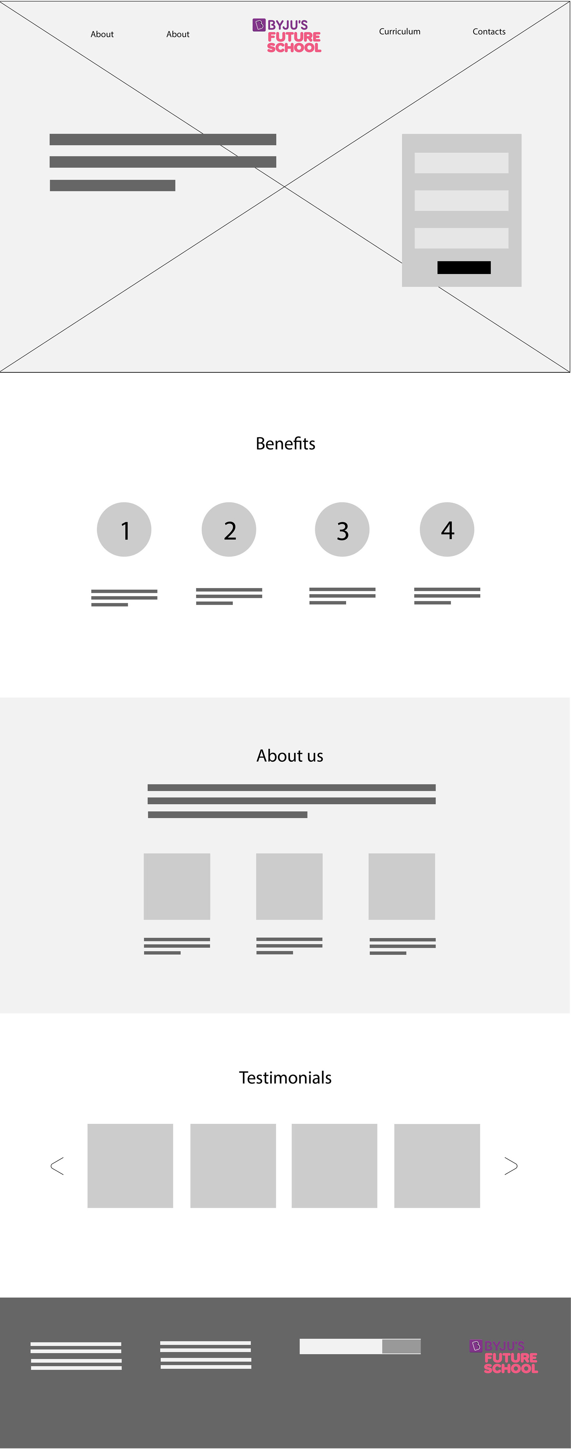
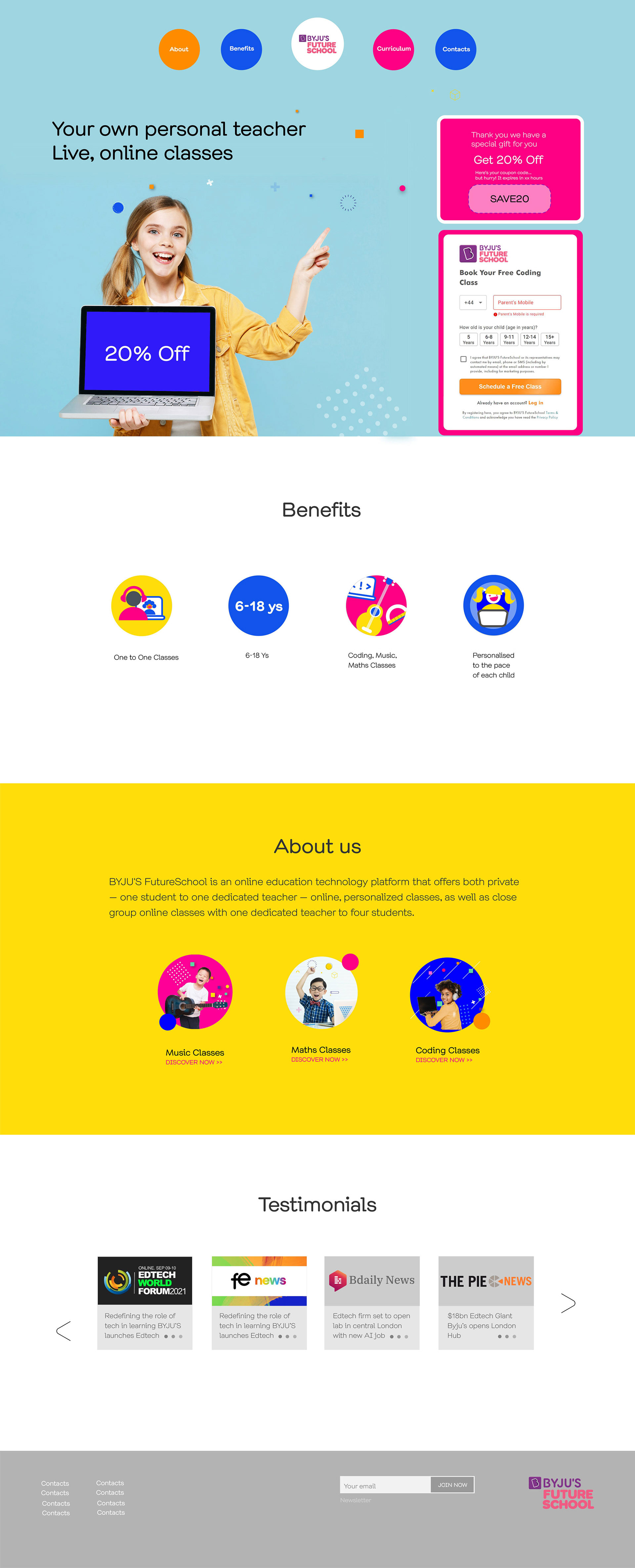
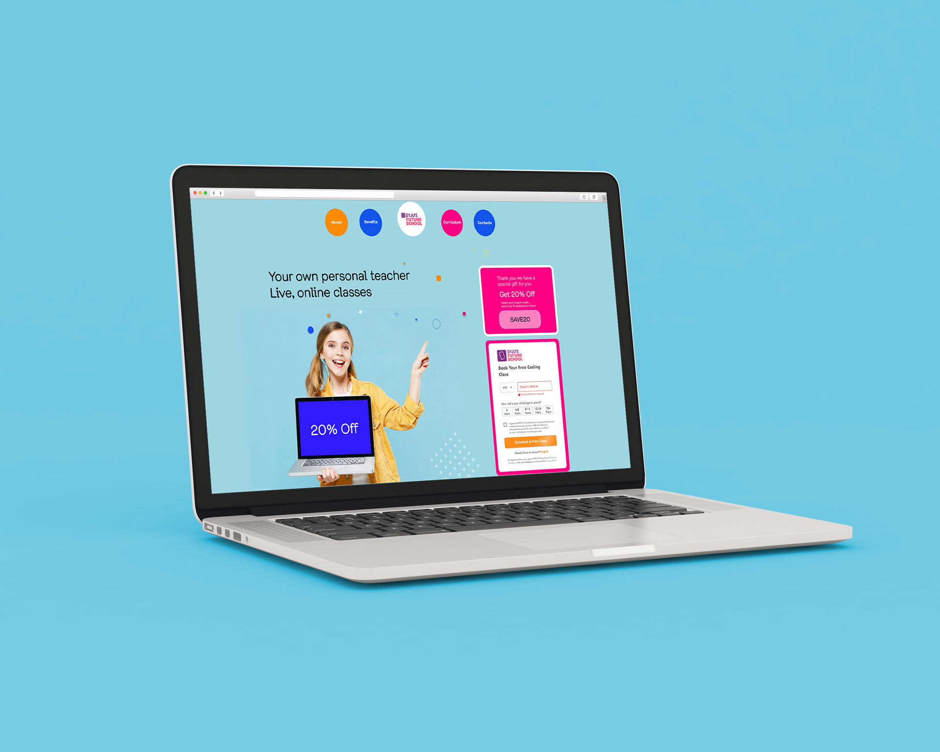
In addition to revamping the visual branding, I also redesigned the UX of some elements, such as the landing page shown here, delivering an easily adaptable template.
The previous landing page lacked a clear hierarchy, with three equally important sections competing for the user's attention. To solve this, I proposed a design that redistributed key information across the page in a clearer structure, using concise text, graphics and icons to highlight the main concepts.
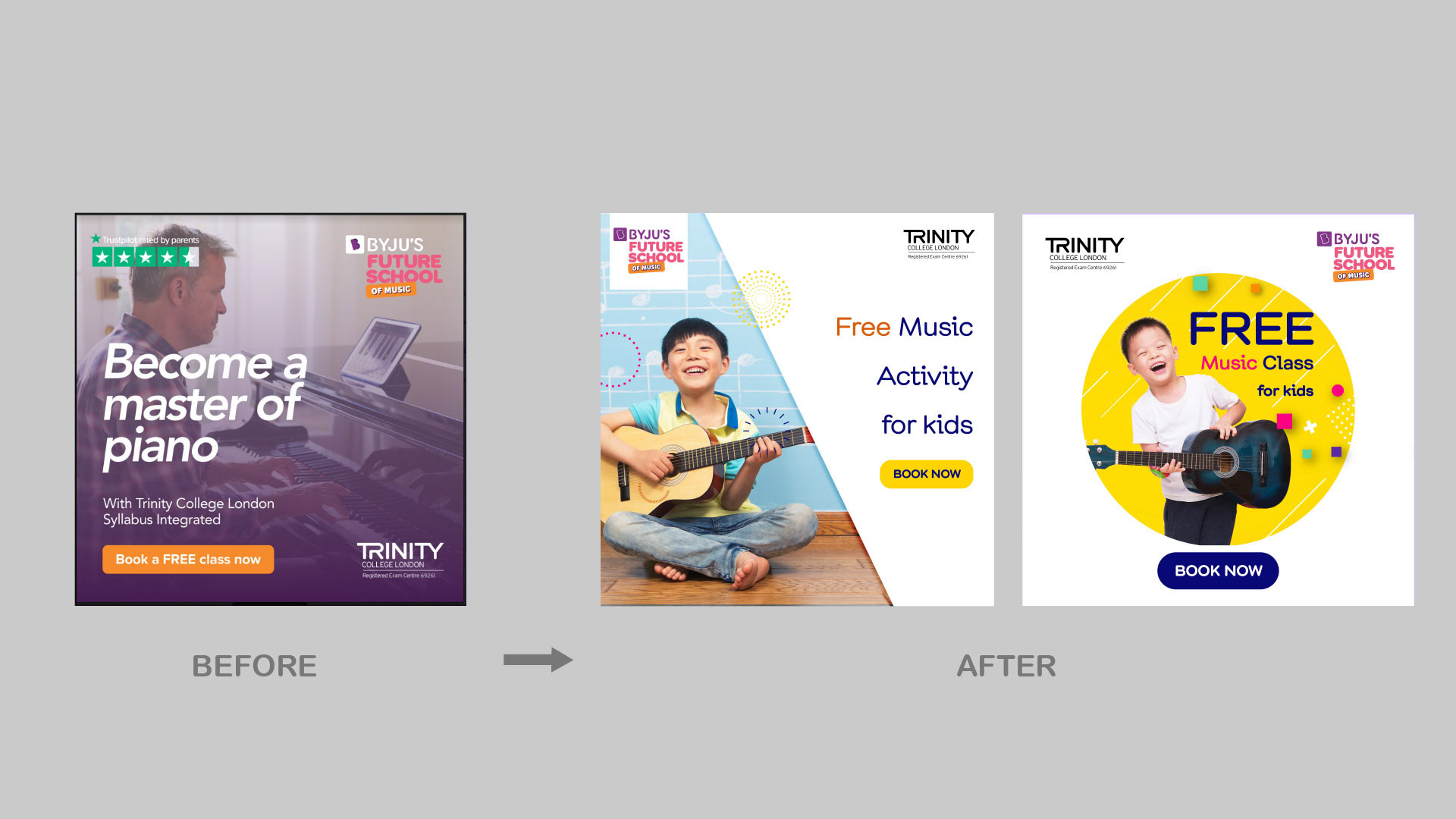
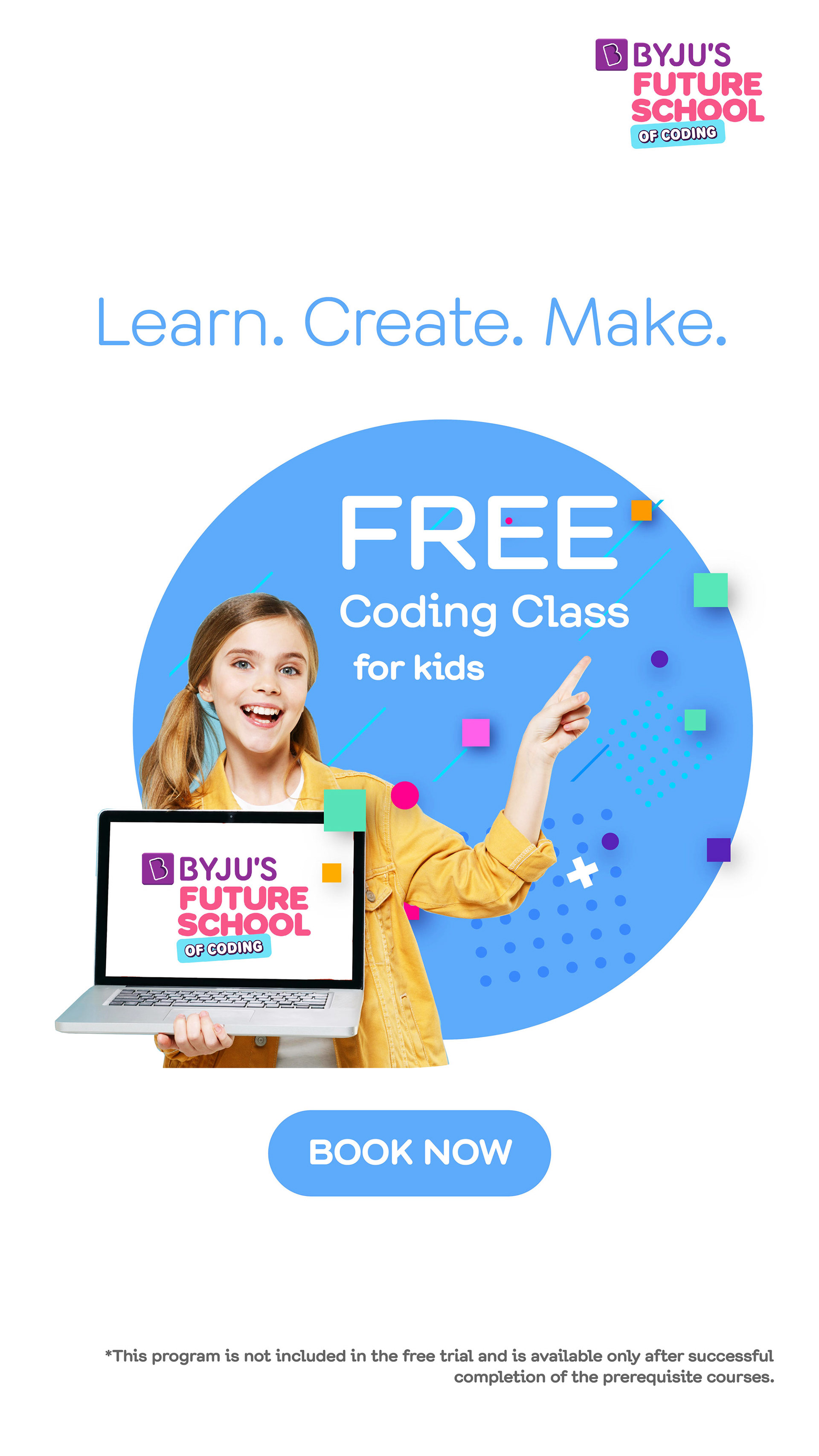

Graphical elements on the top of photography, give strength to actions, direct attention, and symbolize thoughts, ideas, mental calculation and in general the activity of thinking and learning.
Conversion design principles are amply used in any piece of communication I conceptualized and proposed. Scenes, copy and CTA are often framed or encapsulated to direct attention to them. As well as, the use of colour and contrast, white space, directional glaze and directional clues all helped in directing the attention on specific actions for the user to accomplish and delivering clearly the main message. I also opted for a clearer text hierarchy, outlining visually any eye-catching word like 'free', emphasizing urgency and scarcity of time-bounded promotions, and inserting social proof whenever appropriate.
